| Pages in topic: [1 2 3] > | Do we want prospective customers to love us? Thread poster: Philippe Etienne
|
|---|
Or even more importantly, do prospective customers have to love us to contemplate business with us?
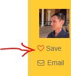
I just noticed a #heart# Save button in the Directory, whereby, I assume, people browsing proz.com can pick profiles they find interesting on the fly and make up a list of prospective translators for whatever purposes.
I think I spotted a similar "Save" button on my profile some time ago, but it's no longer there.
In itself, I find the feature relevant. But the hear... See more Or even more importantly, do prospective customers have to love us to contemplate business with us?
I just noticed a #heart# Save button in the Directory, whereby, I assume, people browsing proz.com can pick profiles they find interesting on the fly and make up a list of prospective translators for whatever purposes.
I think I spotted a similar "Save" button on my profile some time ago, but it's no longer there.
In itself, I find the feature relevant. But the heart icon... Why not a unicorn?
Can we unite our great translators' minds to figure out a choice of icons that would look less "social" than a Heart or a Thumbs up, while conveying what the button is meant to do?
Or am I just a grumpy old f*rt who can't adapt to the modern era of... what, by the way?
Here are my suggestions:
- Nothing
- A star, the Favorites symbol in many apps. Or starfish
- An IT-type icon showing intricate links and dots, ie. obscure unless you know what it means
- An "In" tray
And you, what would you choose to convey the idea of "This profile looks promising for my next translation assignment, I'll put it in my list for further reference"?
Philippe ▲ Collapse
| | | | Mervyn Henderson (X) 
Spain
Local time: 12:21
Spanish to English
+ ...
| Who needs a heart ... | Jul 18, 2017 |
... when a heart can be broken? What's love got to do with it etc.
I dunno, maybe I'd use an all-teeth-showing smiley, or something lame like that.
It could also be interesting to consider what one might use to convey the idea of definitely NOT using this profile.
| | | |
Sorry, but I am a bit confused: 'Do prospective customers have to love us?'
To answer your question bluntly 'NO', and I don't have to love them either, as long as we have a good working relationship. But that is not the issue.
The Proz site is changing, and please have a look at a thread of Proz that is actually right now. I think you should put your question there.
Hence confused.
PS) I just saw that this is an 'Off topic' question, but still.... See more Sorry, but I am a bit confused: 'Do prospective customers have to love us?'
To answer your question bluntly 'NO', and I don't have to love them either, as long as we have a good working relationship. But that is not the issue.
The Proz site is changing, and please have a look at a thread of Proz that is actually right now. I think you should put your question there.
Hence confused.
PS) I just saw that this is an 'Off topic' question, but still.... Then ask something else, like 'do you like CAT tools' or something like that. I think this question has to be forwarded to Proz.
[Edited at 2017-07-18 22:22 GMT]
[Edited at 2017-07-18 22:31 GMT]
[Edited at 2017-07-18 22:31 GMT]
[Edited at 2017-07-18 22:32 GMT]
[Edited at 2017-07-18 22:33 GMT] ▲ Collapse
| | | | | It depends at what expense | Jul 19, 2017 |
If because of very low rates, certainly not. To love the profile, why not--although it is not that important.
[Edited at 2017-07-19 07:21 GMT]
| | |
|
|
|
Philippe Etienne wrote:
In itself, I find the feature relevant. But the heart icon... Why not a unicorn?
No, never a unicorn! Unicorns have pierced so many holes in otherwise sane minds! Please, please, please, whatever you wish, but not a unicorn.
[Edited at 2017-07-19 07:31 GMT]
| | | | Sheila Wilson 
Spain
Local time: 11:21
Member (2007)
English
+ ...
| Why is an icon needed? | Jul 19, 2017 |
I think you're referring to the one where it says "SAVE" in black and white (or green, whatever) alongside this heart? So why use the symbol/icon at all? Why not just use good old words? Save, favourite, bookmark... They all work better for me than a heart.
Ban icons, bring back words!
| | | | | OK, I missed my point! | Jul 19, 2017 |
Thank you for your replies about Tina, confusion, economics and unicorn evil.
And thank you Sheila for you support!
I'll try to be more specific.
Example (line breaks within URL to avoid browser window width expansion)... See more Thank you for your replies about Tina, confusion, economics and unicorn evil.
And thank you Sheila for you support!
I'll try to be more specific.
Example (line breaks within URL to avoid browser window width expansion):
http://www.proz.com/translator-directory/?sp=directory&to=.fl&from=din&pair_emphasis=1&sdl_trados_cert_level=na&
sdlx_cert_level=na&field=&latitude=&longitude=&distance=50&keyword_cv_checkbox=on&orderby=&mode=view&from=esl&
to=dut&pair_emphasis=1&native=&field=&type=na&skill_interpreting=Any&distance=50&location=&latitude=&
longitude=&country=&cred=na&software=na&sdl_trados_cert_level=na&sdlx_cert_level=na&orderby=&avail=na&
keyword=&keyword_cv_checkbox=on&wwa=na&profile_last_updated=any&posted_wiwo_within_days=&orderby=
In the Directory page, 2nd column below the profile image, you have a heart symbol, next to a "Save" button.
Here a screenshot :

There is no confusion about the actual meaning, there's even a tooltip when you hover over the button, but I'm not sure a heart icon is relevant in business relationships.
The first time I saw this, I thought the Translation Devil had sent me to a dating site.
Hence my suggestion to find ideas to replace this symbol with something else. Or nothing.
Enjoy your day,
Philippe
[Edited at 2017-07-19 08:29 GMT] ▲ Collapse
| | | | | Hearts versus stars | Jul 19, 2017 |
The heart is a fairly standard (albeit slightly more recent) icon for marking favourites on the internet. The most common alternative would be a star. I believe, however, hearts have been shown to increase user engagement and the amount of time spent on the related page and the likelihood the user will return to view the page again. Additionally, the star icon could be used for saving a page for any reason, whereas the heart implies a positive association.
I think all of that rather... See more The heart is a fairly standard (albeit slightly more recent) icon for marking favourites on the internet. The most common alternative would be a star. I believe, however, hearts have been shown to increase user engagement and the amount of time spent on the related page and the likelihood the user will return to view the page again. Additionally, the star icon could be used for saving a page for any reason, whereas the heart implies a positive association.
I think all of that rather plays in our favour as service providers looking to establish positive connections.
I don't know how to put this politely, except to ask you believe me that I say this sympathetically, but objections to this icon might come down to fuddy-duddiness. Given that most of our clients - even those representing companies in traditional or technical fields - work in some form of marketing, I think it is fair to assume they are familiar with modern digital practices and are unlikely to be shocked by seeing this heart icon. Nor are they likely to confuse it with the sort of bookmarking used on a dating site; nowadays people just swipe right. ▲ Collapse
| | |
|
|
|
Tom in London
United Kingdom
Local time: 11:21
Member (2008)
Italian to English
Q. Do we want prospective customers to love us?
A. No. Love has got nothing to do with it.
| | | | Oksana Weiss 
Germany
Local time: 12:21
Member (2011)
English to Russian
+ ...
| +1 for a star | Jul 19, 2017 |
A star is intuitively perceived as "favorite" or "bookmark" and is widely used on popular German web-sites such as ebay and others. Perhaps it is conservative and old-fashioned, but we are already used to it. On the other hand, the heart is a bit confusing as it is often associated with the dating sites:)
| | | |
Philippe Etienne wrote:
In itself, I find the feature relevant. But the heart icon... Why not a unicorn?
It's just an icon. If every icon was required to follow your logic, we'd all still be using floppy disks...
| | | | Inga Petkelyte 
Portugal
Local time: 11:21
Lithuanian to Portuguese
+ ...
Philippe Etienne wrote:
Thank you for your replies about Tina, confusion, economics and unicorn evil.
And thank you Sheila for you support!
I'll try to be more specific.
Example (line breaks within URL to avoid browser window width expansion):
http://www.proz.com/translator-directory/?sp=directory&to=.fl&from=din&pair_emphasis=1&sdl_trados_cert_level=na&
sdlx_cert_level=na&field=&latitude=&longitude=&distance=50&keyword_cv_checkbox=on&orderby=&mode=view&from=esl&
to=dut&pair_emphasis=1&native=&field=&type=na&skill_interpreting=Any&distance=50&location=&latitude=&
longitude=&country=&cred=na&software=na&sdl_trados_cert_level=na&sdlx_cert_level=na&orderby=&avail=na&
keyword=&keyword_cv_checkbox=on&wwa=na&profile_last_updated=any&posted_wiwo_within_days=&orderby=
In the Directory page, 2nd column below the profile image, you have a heart symbol, next to a "Save" button.
Here a screenshot :

There is no confusion about the actual meaning, there's even a tooltip when you hover over the button, but I'm not sure a heart icon is relevant in business relationships.
The first time I saw this, I thought the Translation Devil had sent me to a dating site.
Hence my suggestion to find ideas to replace this symbol with something else. Or nothing.
Enjoy your day,
Philippe [Edited at 2017-07-19 08:29 GMT]
OIt was very clear what you meant in your first post and I wonder how come some of us didn«t get it - us, translators/interpreters?
As for the rest, I fully agree with Sheila - all those icons look so infantile. The favourites star could be the only exception, perhaps.
| | |
|
|
|
Philippe Etienne wrote:
Do we want prospective customers to love us?
That would be great. If ProZ added an "Unconditional Love from Clients" feature to their "Plus basket", I'd be sold.
Here are my suggestions:
- Nothing
- A star, the Favorites symbol in many apps. Or starfish
- An "In" tray
All of the above, or a simple check mark. But "nothing" is perfectly fine, IMHO. Don't really care either way, but yes, a heart kind of seems out of place in a business setting...
| | | | | Thank you everybody for your replies | Jul 20, 2017 |
It's always interesting to have other people's views. I'll quickly wrap up this matter:
Georgie Scott wrote:
...I believe, however, hearts have been shown to increase user engagement and the amount of time spent on the related page and the likelihood the user will return to view the page again. Additionally, the star icon could be used for saving a page for any reason, whereas the heart implies a positive association.
I think all of that rather plays in our favour as service providers looking to establish positive connections...
Pardon my ignorance. This is very enlightening. If such research applies to populations looking to assign their translation work, then a heart is fully justified.
I just hope nobody will ever introduce animated kissing lips as the next-gen customer engagement enabler. The prospect of being kissed or kissing people I wasn't introduced to, even virtually, is beyond me. Partly because I only work when I'm sober.
Georgie Scott wrote:
...objections to this icon might come down to fuddy-duddiness...
Fiona Grace Peterson wrote:
It's just an icon. If every icon was required to follow your logic, we'd all still be using floppy disks...
Thank you for putting it politely. Grumpy old f*rt was an alternative I also considered, but it may be a bit weak.
Just an icon, yes, but apparently icons may subliminally guide our reptilian brains. I wouldn't be surprised.
Granted, the subject is frivolous, but still, I find this heart out of place. Not shocking, just irrelevant, in all logic. For instance, LinkedIn, the self-proclaimed professional social network, doesn't seem to use hearts, as opposed to Twitter and the, err, Likes.
But if hearts bring better outcomes, are in fashion or just "look nice", then fine with me. I'm not really aware of all that.
Inga Petkelyte wrote:
...all those icons look so infantile...
"Everything visual" and "Stay young" combined! While benefits are obvious for illiterate people, for foreigners or in case of space restrictions, I sometimes find icons more difficult to figure out than a plain old letter-laden word.
Mirko Mainardi wrote:
...a simple check mark...
This would also be more relevant than a heart in my opinion. I also thought of a big plus sign.
And true, love from prospects should be included in the Plus package!
Anyway, if what I perceived as a heart simply illustrates a diseased ivy leaf, I heartily think this icon should stay.
Ivy creates very strong bonds indeed.
Recycle your waste,
Philippe
| | | |
I should point out that you're in good company. Even though I'm arguing the case for its use, everyone that knows me has to put up with my tirades against most things new and hip. I'm only 31 but it didn't stop me asking the church nextdoor to turn the music down on their Bastille day celebrations the other week - it was almost midnight and they were playing techno music, after all.
| | | | | Pages in topic: [1 2 3] > | To report site rules violations or get help, contact a site moderator: You can also contact site staff by submitting a support request » Do we want prospective customers to love us? | Trados Business Manager Lite | Create customer quotes and invoices from within Trados Studio
Trados Business Manager Lite helps to simplify and speed up some of the daily tasks, such as invoicing and reporting, associated with running your freelance translation business.
More info » |
| | Trados Studio 2022 Freelance | The leading translation software used by over 270,000 translators.
Designed with your feedback in mind, Trados Studio 2022 delivers an unrivalled, powerful desktop
and cloud solution, empowering you to work in the most efficient and cost-effective way.
More info » |
|
| | | | X Sign in to your ProZ.com account... | | | | | |


